Wednesday, October 27, 2010

Little Sister Crow

Little Sister Crow
Been thinking about fairytales lately, anyway... here is something that emerged out of my late night meanderings last night. Slightly disturbing.
Pencil sketch photoshopped up... has kind of ended up looking like a CD cover for an edgy acoustic grunge band from the mid 90s.

Tuesday, October 26, 2010

Squidboard


Here is a very short stop motion film I was involved in the making of in 2009: "Squidboard."
It was created as part of a course run at the Cape Film Commission, and was basically an introduction to stop-motion film-making.

The Squidboard team consisted of:
Masha du Toit
Jacqueline van Meygaarden
Marko Petrik
Hilette Stapelberg
Yazeed Kamaldien

This 30 second animation was created using only paper cutouts for puppets. The process involved each paper element being moved incrementally and then photographed. All the photos, some 800 of them, were then stitched together into a film running at around 12 frames per second. Filming time for the 30 second animated sequence took a day to set up, and another full day was spent filming--a record by industry standards! Sound and titles were added post-production.

A special thanks goes to all friends, family, and significant others involved in the hard work on the project. Without you this project would not have been possible!

Monday, October 18, 2010

Pulse Artwork Part 2

Right... Part 2
So I reverted with some pencils... here is the inked version below...
I've added a championship belt to drape over His shoulder--I actually spent quite a lot of time on it's design--it says "King of Kings" and has angels holding the earth, and lots of stars. Unfortunately you can't see it... sigh. 
Besides "King of Kings" I've added various references to the other names of Christ throughout the image. The subsidiary buckles have the greek capital letters for alpha and omega on them, surrounded by a compass rose, and the tattoos on Christ's forearms are the Greek words and , "faithful" and "true".

The heart is burning--which is a direct reference to catholic iconography, but obviously the meaning is different here (read Part1 ). The client was quite happy with the conflation of iconography, so we went with it.


Inks and layers
 The coloured version is below...
With the colouring and titling, I heavily referenced Mexican Lucha Libre iconography. 
This is something that I should have mentioned earlier, the image has a deliberate Lucha Libre slant---> this is the Mexican form of WWE. The wrestlers often wear colourful masks and often incorporate religious symbolism into their costumes, such as crosses, etc. which worked well for the subject matter here.
Pulse: finished artwork

The final step, below,  was to add a texture I photographed from a wooden wagon wheel in Turkey.

Pulse: my fave... but not the one used by the client

Pulse Artwork Part 1

Recently I received a commission to design the logo for King's Cross Training's youth group, Pulse. King's Cross is a Christian college located in Rustenberg, SA.
What we were attempting with this image, was to personify aspects of Christ's character in a relevant, contemporary way, rather than make a portrait of Him, per se. 
There is somewhat of a backlash in Christian circles around how Christ is typically portrayed: blonde, weak-looking, a bit hippyish. As Mark Driscoll often points out, it's no wonder so few men want to be Christians when there God looks like that. So this was our attempt to change that...

The course of action was to depict Christ as a  a wrestler, with the core scripture of the Pulse group written on His arm... During this time, the name of the youth group also changed from "72" to "Pulse".
My initial scamps focused quite strongly on Jesus basically beating down the Devil.


Smash!
Stamp!


The client reverted with with the idea that they wanted the image to convey that Jesus holds the believer's heart in His hands... this was my solution... and frankly, with hindsight, I'm glad we didn't go with it! -->a bit too "burning human sacrifice" for what Pulse was trying to get at.


So another revert... and the heart with chopped off veins is converted into a "Valentine's"  heart--much better idea for conveying emotion, rather than the idea of a physical organ!


 I want to add some more pics here, but it seems Blogger has fallen down in it's inimitably crappy style... so I'll have to save them for another post.


Halloween Party!

This is an invite I recently created for my friend Juli's Halloween party... and it's open, so you're invited! Just dress up, m'kay?
Artwork elements from  the brilliant Artemio Rodriguez and the equally brilliant but unfortunately dead Jose Guadalupe Posada.Click for a larger image.

..

Halloween Party!

Wednesday, October 13, 2010

Slumdog Guttercat

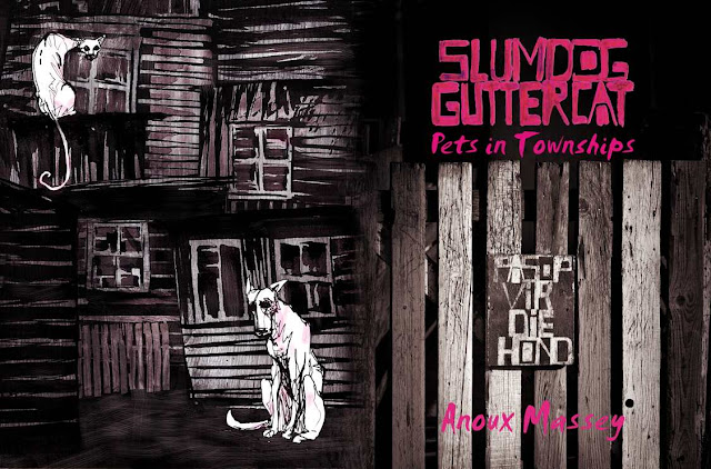
 So recently I was commissioned to do the cover art for Slumdog Guttercat. This is a book by Anoux Massey, with lavish black and white photographs by my friend, the amazing Tracy Robertson , and published by the talented team at ReadHill/Mousehand. Anoux is involved in animal welfare, and the books deals with her journey and work in this cause.

The cover went through several reverts, below. Click on the images for a closer view.

Initially the idea was for a double spread illustration, mostly monochrome, but with highlights in magenta. This follows quite closely with the book's interior design, which is black and white with small magenta elements.


This was the second version, with a grittier style, to try and match the internal images in the book.


 This was the final version, after several reverts. Between the publishers and myself, we came to the decision that to miss a photographic element to the cover would be to almost misrepresent the interior styling of the book. The particular photo we went with was, I think, a good choice, as it was highly illustrative in its nature, as well as pushing the artwork in a more conceptual direction. One is told "beware of the dog" (in Afrikaans) which kind of speaks in an ambivalent about the way pets are seen.
The illustration takes up the back page, and space has been left for writing on the spine, as well as a blurb. Here I integrated as much of the texture of the fence into the drawing as possible.

We also went with a more illustrative looking font, Smudger, to give the book more of a hand-drawn feel, and to match the font used in the photo.


Wednesday, October 6, 2010

Mercedes SL 55

This is a fairly recent illustration I did for Mercedes Magazine.
Layers and layers of effects! The big squiggles are paint strokes that I scanned in and distorted.
Click for a larger view. 
...


Close up...