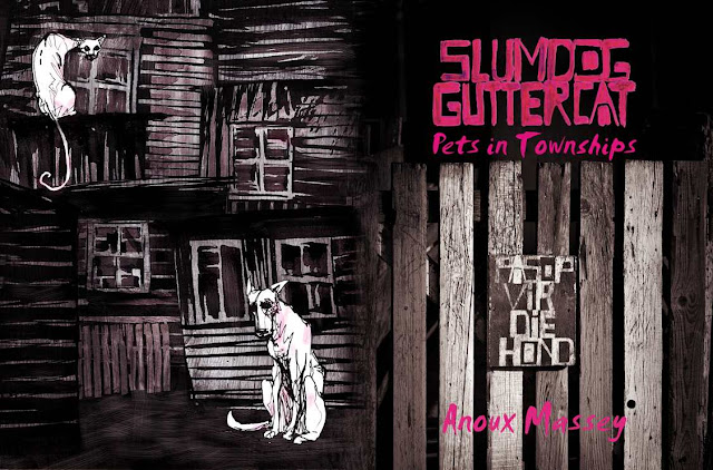
So recently I was commissioned to do the cover art for Slumdog Guttercat. This is a book by Anoux Massey, with lavish black and white photographs by my friend, the amazing Tracy Robertson , and published by the talented team at ReadHill/Mousehand. Anoux is involved in animal welfare, and the books deals with her journey and work in this cause.
The cover went through several reverts, below. Click on the images for a closer view.
Initially the idea was for a double spread illustration, mostly monochrome, but with highlights in magenta. This follows quite closely with the book's interior design, which is black and white with small magenta elements.
This was the second version, with a grittier style, to try and match the internal images in the book.
This was the final version, after several reverts. Between the publishers and myself, we came to the decision that to miss a photographic element to the cover would be to almost misrepresent the interior styling of the book. The particular photo we went with was, I think, a good choice, as it was highly illustrative in its nature, as well as pushing the artwork in a more conceptual direction. One is told "beware of the dog" (in Afrikaans) which kind of speaks in an ambivalent about the way pets are seen.
The illustration takes up the back page, and space has been left for writing on the spine, as well as a blurb. Here I integrated as much of the texture of the fence into the drawing as possible.
We also went with a more illustrative looking font, Smudger, to give the book more of a hand-drawn feel, and to match the font used in the photo.


Comments
Post a Comment